How to use an analogous color scheme in any room
An analogous color scheme uses three neighboring shades on the color wheel. Learn how to pick your colors and apply them to walls, textiles and decor.
- Styled by Kellan Langley
- 8 minute look
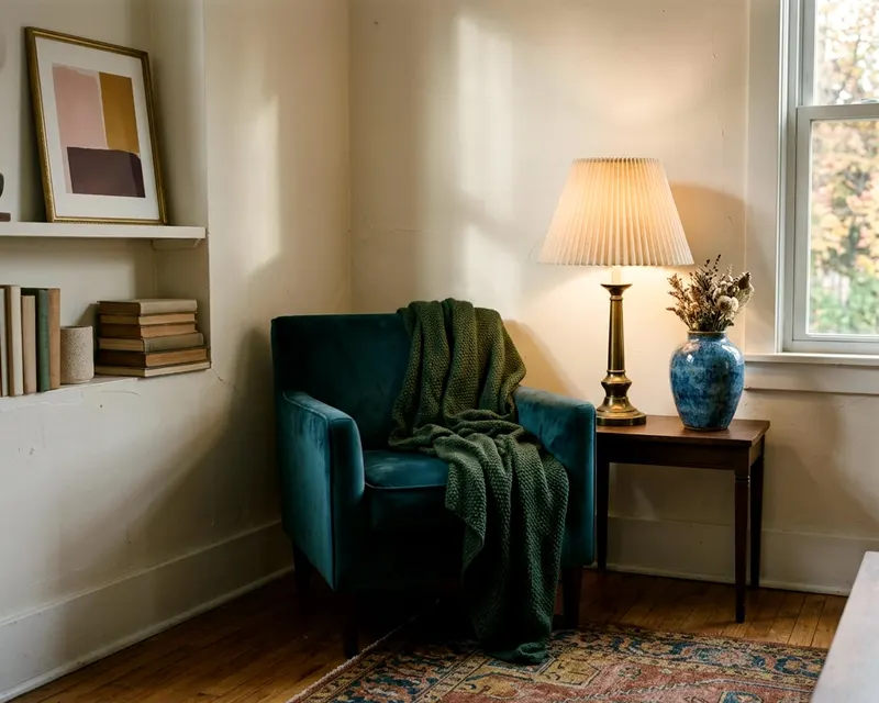
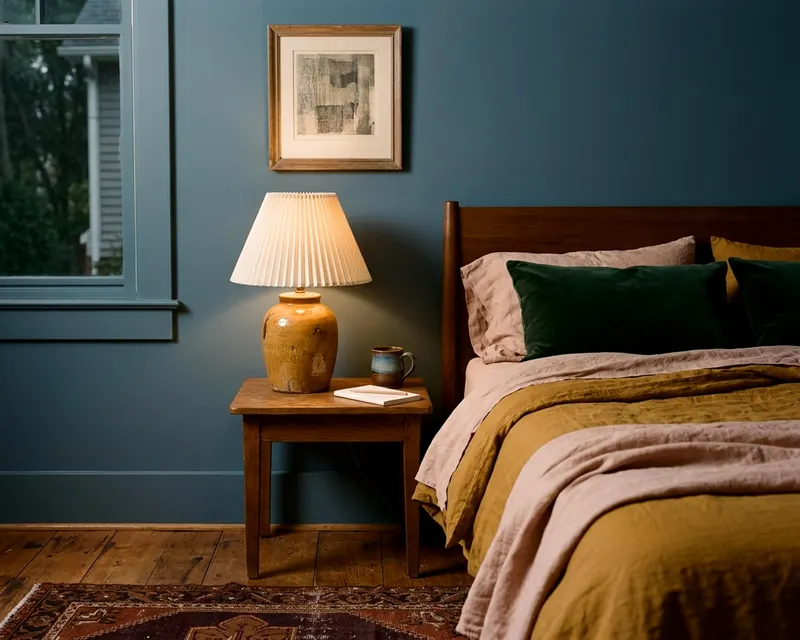
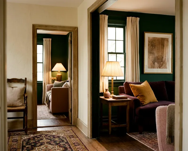
An analogous color scheme takes three colors that sit side by side on the color wheel and uses them to decorate a room. You pick one shade to dominate the space, a second to support it and a third to act as an accent. The close relationship between the shades gives you a deeply colorful room that still feels restful.
What an analogous color scheme looks like
Look at a standard color wheel. The twelve sections display the primary, secondary and tertiary colors. Pick any slice of color. The slices directly to its left and right form an analogous group.
A classic trio is blue, blue-green and green. Another combination is red, red-orange and orange. These colors share a base hue. That shared base makes them blend smoothly in a room.
They never fight for attention the way opposite colors do. You skip the sharp contrast of a complementary room.
This scheme differs from a monochromatic room. A monochromatic space uses just one single hue, mixed with white or black to create different tints and shades.
An analogous room uses three distinct colors. The jump from blue to green gives the eye more to process. You get the rich, layered feeling of a multi-color room. The shared roots keep the space looking calm.
Selecting three neighbor shades from the wheel
Start with the color you love most. This is your anchor. Look at the color wheel to find the immediate neighbors on either side.
You might anchor your room on a soft sage green. The wheel gives you a blue-green on one side and a yellow-green on the other. This forms your trio.
You can also pick three colors that move in one direction around the wheel. Anchor on true blue, add blue-green, and finish with true green. Do not stretch too far around the circle.
Keep the three colors touching. If you skip a space on the wheel, you lose the harmony. The goal is a tight family of shades.
Building one color palette for your home often starts with this simple group of three.
How do you test these colors in your house? Gather a few simple items before you buy gallons of paint:
- Large paper paint swatches from the hardware store
- A piece of white poster board to isolate the colors
- Fabric scraps in your chosen support and accent shades
- Painter's tape to stick the swatches to the wall
Assigning the main, support and accent roles
Give each color a specific job. Equal parts of three different colors will confuse the eye. Pick one color to lead the room.
The main color covers the largest surface areas. Paint the walls, choose a large rug or buy your main sofa in this shade. This color sets the baseline for the space.
The second color is your support. Give this shade less space than your main color. The drapes, an accent chair or a painted bookcase carry the support color well. The fabric on a side chair breaks up the main color and adds visual interest.
The third color is your accent. Sprinkle it lightly around the room. A throw pillow, a ceramic lamp base or a small painted tray works well.
The lamp base sitting on a dark table draws the eye instantly. You only need a few touches of the accent color to complete the scheme. If you add too much, the accent becomes a support color and upsets the balance.
Setting the mood with warm or cool schemes
The side of the color wheel you choose sets the feeling of the room. Warm analogous color schemes use reds, oranges and yellows. These shades tend to feel closer.
They can make a large room feel close and energetic. A dining room decorated in rust, terracotta and golden yellow feels lively. It encourages conversation over dinner.
Cool analogous color schemes use blues, greens and purples. These colors tend to feel farther away. They can make a space feel calm and clean.
You often see them in a bedroom or a quiet study. A room layered in navy blue, teal and forest green feels restful.
Wondering which living room paint colors will work best? Look at the direction your windows face. Cool colors often balance hot afternoon sun in a west-facing room, and warm colors usually brighten a shaded, north-facing room.
Giving the eye a break with neutral contrast
Analogous colors sit close together on the wheel. They lack the sharp contrast of opposite colors. A room filled only with these three shades can feel overwhelming.
Add neutral tones to give the eye a resting place. Crisp white ceiling paint, a beige linen chair or a soft gray rug breaks up the rich colors. A charcoal gray sofa provides a massive, quiet anchor in a room full of energetic oranges and yellows.
Bring in natural materials to ground the scheme. Warm oak floors provide a solid base. The wood grain adds warmth without competing with your three chosen colors.
A walnut coffee table brings in a deep, rich brown. The table acts as a neutral anchor in the center of the room.
Metals also add necessary contrast. Brass cabinet pulls or a matte black steel floor lamp add crisp definition to the room.
The metal finishes catch the light. They break up heavy blocks of color. A shiny brass sconce on a matte painted wall catches the eye.
Spreading the colors across walls, textiles and art
Apply your three colors unevenly across different layers of the room. Start at the edges and work your way in. The walls usually take the lightest version of your main color.
Moving inward, a large rug might carry a darker version of that same shade. This creates a box of your main color.
Use your support color on the window treatments and the main seating. A pair of heavy linen drapes in your support color draws the eye up the wall. A sofa in the same shade anchors the center of the room.
Let the accent color jump around the space. Frame a piece of art that features a bright splash of your accent shade. Place a glass vase in that same color on a side table.
Drape a thick wool blanket over the sofa arm. When you decorate a living room, spreading the accent color pulls the whole layout together. The eye bounces from the pillow to the art to the vase, taking in the whole room.
Patterns help tie the scheme together. Look for a patterned rug or a floral throw pillow. Ensure the fabric includes all three of your colors. A single patterned item proves to the eye that the three colors belong together.
Creating a calm analogous scheme in the bedroom
Bedrooms require a softer touch than a busy living room. You want the space to feel restful. Dial back the brightness of your chosen colors.
If you pick a pink, red and orange scheme, avoid neon shades. Choose a soft blush pink, a faded terracotta orange and a deep burgundy red.
Apply the lightest color to the walls and the ceiling. This wraps the room in a gentle shade. Use the medium shade for your heavy bedding and your drapes.
Save the darkest color for the small details. A dark burgundy lamp base or a small patterned throw pillow grounds the bed. The dark color provides weight without making the room feel busy.
Limit the busy patterns in a bedroom. Solid blocks of analogous colors feel more restful than loud floral prints. Let the texture of a quilted blanket or a woven rug do the talking. The raised threads of a quilt provide enough interest on their own.
Adjusting the colors for your lighting
Light changes how we see color. A blue-green that looks perfect in a store might look muddy in your house. The lightbulbs you use will shift the whole analogous scheme.
Standard warm lightbulbs cast a yellow glow. They make warm colors look richer. They can turn cool blues slightly green.
Test your three paint swatches under the exact lamps you plan to use. Turn them on at night. If your green turns yellow, you might need a bulb with a cooler color temperature.
A daylight bulb casts a blue hue. The blue light cools down warm reds and oranges. Find a bulb that keeps your three colors distinct.
Natural light shifts throughout the day. Check your swatches in the morning, at noon and in the late afternoon. Make sure you like the scheme in all three lighting conditions. You want the colors to stay true before you open a can of paint.
Mistakes that make an analogous room look flat
A bad analogous color scheme looks like a blur. You can avoid this flat look by mixing light and dark tones. Do not use three pale pastel colors together.
Do not use three heavy jewel tones together. Make one color pale, one medium and one deep.
A pale blue wall, a medium green sofa and a dark navy accent chair work beautifully together. The dark chair grounds the pale wall. The medium sofa bridges the gap between them.
Texture also prevents a flat room. Colors that sit close on the wheel can blend into each other easily. Different materials make them stand out. A velvet pillow, a linen curtain and a wool rug show color differently.
The velvet catches deep shadows. The linen lets natural light pass through. The wool absorbs light. The textures keep the fabrics distinct even when the dye is the same blue-green.
Keep your whites clean. A muddy room often happens when the neutral colors clash with the analogous shades. Match the undertone of your white paint to your color scheme.
A warm scheme needs a creamy white ceiling. A cool scheme needs a crisp, pure white.
Do not cluster all your accent colors in one corner. Spread them out to keep the eye moving. If your dark navy accents all sit on one side of the living room, that side will feel heavy. Balance the room by placing a navy throw pillow on the left side and a navy ceramic vase on the right side.