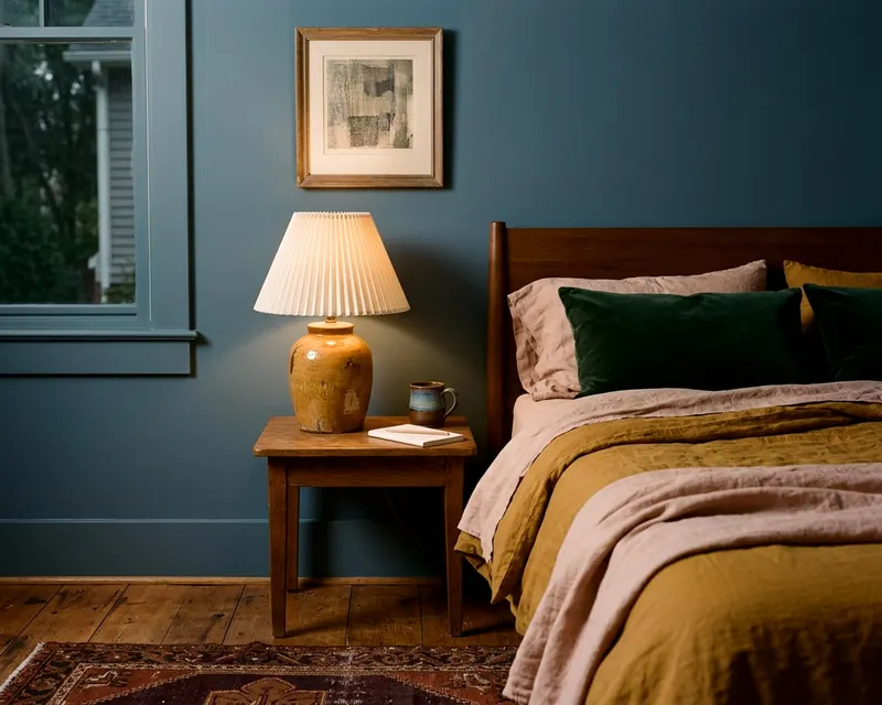
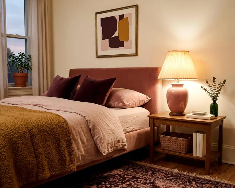
How to build one color palette for your whole house
Building a color palette interior design plan for your entire home makes each room flow naturally into the next without looking exactly the same.
- Styled by Kellan Langley
- 8 minute look
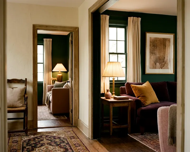
A whole house color palette connects your rooms through a shared set of neutrals and accent shades. You choose one main neutral for the open spaces, select three to five other colors, and mix how you use them from room to room. This creates a natural flow without making every space look identical.
Why a shared palette connects your rooms
The hallway leads to the living room. The living room opens to the kitchen. A house feels choppy when colors jump randomly from one space to another. A planned color scheme links those sightlines.
You assign specific roles to a small group of colors. One shade covers the living room walls. That same shade appears on the kitchen cabinets.
A second color serves as the bedroom wall color. That color then shows up as a throw pillow in the adjoining hall. The eye travels easily through the home.
Repetition tells the brain these rooms belong together. A house feels calmer when the colors make sense. You do not need to paint every room the exact same color. That approach leaves a house feeling flat.
Instead, you vary the proportions. A color that dominates the dining room acts as a tiny accent in the kitchen. The connection remains clear.
Creating an analogous color scheme works well if you want colors close together on the wheel. You can also build strong contrast. The key is planning the whole system before you buy the first can of paint.
Start with the finishes that stay
The oak floor sets the baseline. The kitchen cabinets carry their own weight. Stone fireplaces and bathroom tiles bring their own undertones.
These elements dictate the direction of your palette. You cannot ignore them. Warm wood floors can clash with stark cool grays. Red brick fireplace surrounds demand colors that respect their warmth.
Take an inventory of the fixed materials in your house. Check these items before you pick paint:
- Wood floors and baseboards
- Kitchen cabinets and countertops
- Bathroom tiles and tub surrounds
- Stone or brick fireplaces
- Large pieces of built-in furniture
Identify whether these materials lean warm or cool. Warm elements feature yellow, orange or red undertones, while cool elements show blue, green or purple hints.
Neutral elements like pure white or stark black are rare. Most whites have a creamy yellow or crisp blue edge.
Write the undertones down. Your new colors must play nicely with what is already there. Cherry wood floors have a strong red presence. They pair well with greens and warm neutrals.
Slate floor tiles bring cool blue and gray tones. They require cool colors to look their best. A tan stone fireplace calls for warm earthy shades. Treat these fixed finishes as the first colors in your palette.
Choose a base neutral that fits your light
The base neutral carries the heavy lifting. It covers hallways, open living areas and ceilings. You want a white, cream, beige or soft gray.
This color ties the open spaces together. Look closely at the natural light the house gets. The direction of the windows changes how a color looks.
North-facing rooms often receive cooler, bluer light. They need a warm neutral to keep them from feeling chilly. A cream or warm beige works well here.
South-facing rooms often fill with warm light, so they can handle a cool neutral to balance the heat. A crisp white or cool light gray shines in these spaces.
East-facing rooms usually get bright morning light and softer afternoon light. West-facing rooms usually start duller and turn warm by evening.
Buy a few paint swatches. Tape them to the walls in the main living space. Look at them in the morning, afternoon and evening. Turn the lamps on at night.
Finding the right living room paint colors often decides the neutral for the rest of the house. Pick the neutral that looks consistently good across different times of day.
Use this color on the connecting hallways and the main living room walls. It provides a quiet backdrop for your accent colors.
Keep trim and doors consistent
A whole house palette relies on unbroken lines. The baseboards, door frames and window casings provide that line. Paint all the trim in the house the same color.
A crisp white trim sharpens dark wall colors. A soft cream trim warms up cool grays. Painting the trim one consistent shade ties every room together.
The hallway trim matches the bedroom trim. The eye traces that line from space to space. Do the same with the interior doors. Consistency on the edges lets you play with color on the walls.
Pick three to five colors and assign their jobs
Three to five colors give you enough variety without causing chaos. Two colors act as your main supporting shades, and two or three serve as accents.
A dark navy and a soft sage green might be the main colors. A mustard yellow and a rusty red could be the accents.
Look in your closet or at a favorite rug for inspiration. People naturally gravitate toward specific color families.
You might pull colors from:
- A large patterned rug in the living room
- A favorite piece of oversized art
- A patterned sofa fabric or window drape
- A piece of painted furniture you plan to keep
Assign a specific job to each shade. The main colors will cover walls in closed rooms. They work beautifully in bedrooms, dining rooms or small studies.
They also work for large furniture pieces. A navy blue sofa anchors a living room. A sage green bed frame grounds a bedroom.
The accent colors show up in smaller doses. They belong on lampshades, artwork and patterned rugs. Giving colors a job keeps the palette organized.
You avoid the problem of using an accent color heavily in one room and ignoring it in the next. If you love mustard yellow, keep it to the throw pillows and a ceramic vase. Using it on all four walls might overwhelm the space.
Map colors across adjoining rooms
Stand in the hallway. Look at the rooms you can see at the same time. The color flow matters most in these sightlines.
Put the base neutral on the hallway walls. Paint the living room walls in one of the main colors. Use the other main color in the dining room across the hall. The rooms stand apart but relate to the hallway.
You can also build drama. Flip the standard script. Paint a small study a dark accent color.
Bring that same dark color into the bright living room. Paint a built-in bookcase in the dark shade. The connection feels intentional, making the move between rooms feel calm.
Open floor plans need a different approach. Rely heavily on the base neutral for the walls. Keep the color shifts to the furniture and rugs.
Use the kitchen island as an opportunity for color. Paint the island base in one of your main colors. Let the dining chairs carry an accent color.
The kitchen, dining and living areas share one big space. The colors must share the space too.
Closed rooms offer more freedom. A powder room with a closed door can handle a bold application of an accent color. A guest bedroom at the end of the hall can wear a main color on all four walls. The hallway neutral gives the eye a rest before entering the colorful room.
Carry the palette through textiles and decor
Paint handles the walls. Textiles and decor spread the color around the room. A large wool rug anchors the space.
The throw pillows add punches of color to the sofa. The window drapes frame the light. Use these items to distribute your three to five colors.
A living room with neutral walls needs color in the fabrics. A bedroom with dark painted walls needs lighter textiles to provide relief. Look for patterns that include two or three of your chosen colors.
A floral pillow might tie the sage green walls to the mustard yellow accent chair. You can pull a room together quickly this way.
Building a calm and pulled together bedroom relies on this careful repetition of color. The eye recognizes the pattern and reads the room as finished.
Keep the finishes consistent too. A brass table lamp should talk to the brass cabinet hardware nearby. Wood tones on side tables should relate to the wood floors.
Artwork pulls its weight. Hang a large canvas at eye level that features your main and accent colors.
Pull a specific shade from the painting. Use that shade for the lamp base or the window shades.
Small decor items finish the job. Books on a shelf bring blocks of color. A ceramic bowl on the coffee table adds a spot of accent color.
Group items in odd numbers. A tray, a vase and a candle make a good trio. Spread the color evenly around the room.
Do not crowd all the dark colors into one corner. Balance a heavy dark sofa with a dark framed mirror on the opposite wall.
Test the colors before you start painting
Paint looks different on a wall than it does in a store. The light bulb in a room changes how the color reads. A soft white bulb casts a warm yellow glow, and a daylight bulb throws a cool blue light.
Check your fixtures before you test paint. Make sure you use the bulbs you intend to keep. A shade that looks perfect in the hardware store might turn muddy in your bathroom.
Test everything in the actual room. Get large peel and stick swatches of your base neutral and main colors. Put them up in the rooms where they will live.
Leave them there for a few days. Watch how the colors change as the sun moves.
Check them again after dark with the lights on. A gray that looks soft in daylight might turn purple under a warm lamp.
Move the swatches around. Stick them next to the sofa fabric. Place them against the wood floor.
Prop them up behind the nightstand. Check the colors against the door trim.
The contrast between the wall color and the trim color matters. If you plan to use a white trim, tape a piece of white paper next to the swatch.
Pay attention to the paint finish. Flat paint absorbs light and makes colors look softer. Eggshell has a slight shine and is usually easier to wash than flat.
Semi-gloss reflects light and makes colors look brighter. The same color looks different in different finishes. Test the exact finish you plan to use on the walls and trim.
If a color feels wrong in the afternoon, swap it out. Try a shade lighter or a shade darker. Testing a few options costs little.