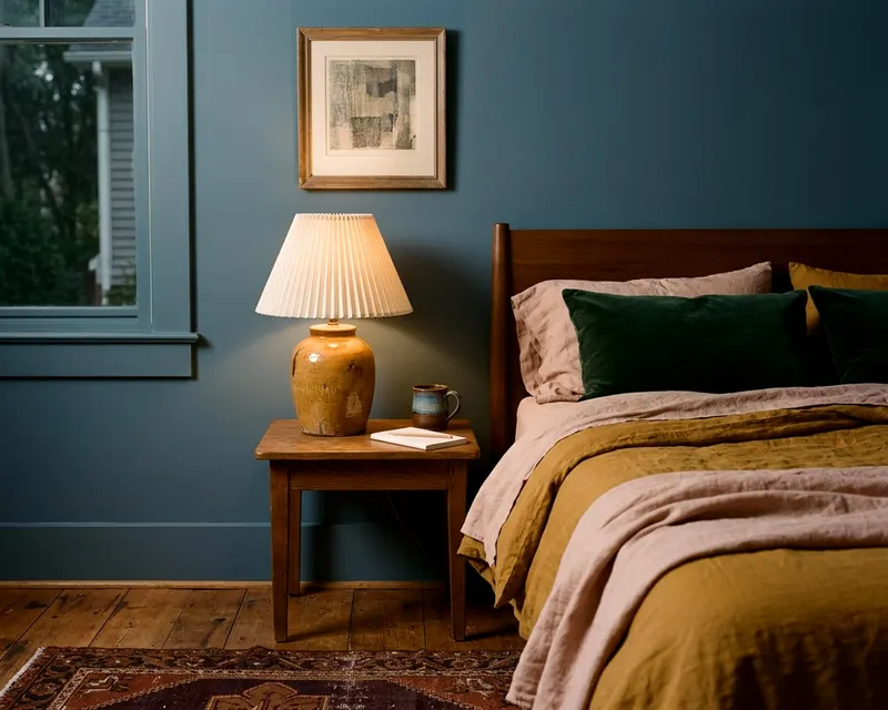
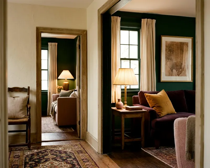
What a monochromatic color scheme is and how to keep it lively
Learn what a monochromatic color scheme is and how to use varying tints, shades, and textures to build a single color palette that feels alive and intentional.
- Styled by Kellan Langley
- 8 minute look
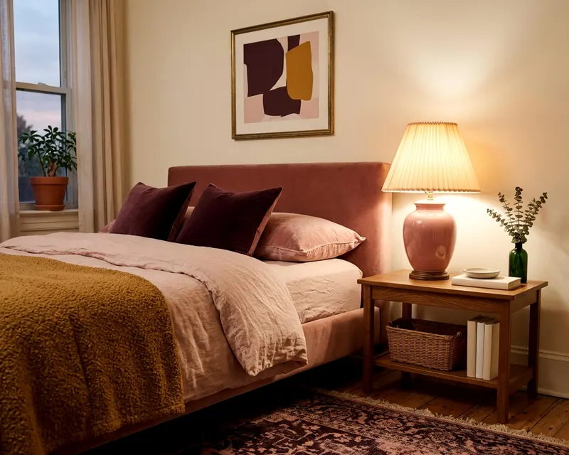
A monochromatic color scheme uses the lighter, darker, and muted variations of a single base color to decorate a room. You build the design by layering these different versions across your walls, furniture, and fabrics. This approach creates a cohesive space that feels intentional and calm.
What a monochromatic color scheme means
The word monochromatic means one color. You pick a single slice of the color wheel and build your whole design around it. A room painted pale blue with navy curtains and denim upholstery follows a monochromatic scheme. You ignore contrasting colors on the opposite side of the wheel and stay entirely within your chosen color family.
Many people assume this means matching everything perfectly. A room where the rug, the sofa, and the walls are the exact same medium green is technically monochromatic, but it usually looks very flat. Good monochromatic design relies on variety. You stretch that single color across a wide range of light and dark.
You use the palest whisper of the hue and the deepest midnight version of it in the same space. A broad range of light and dark variations is how you build one color palette that works across a whole room.
You skip the worry of matching contrasting colors. You can concentrate entirely on how the room feels. A one color room wraps around you and reduces visual noise. This makes a single color scheme excellent for rooms where you want to rest.
Tints, tones and shades of one color explained
You create variety in a one color room by manipulating your base color with white, black, and gray. These additions create tints, shades, and tones. Paint collections often use these three variations.
Color variation | What you mix in | How it feels in a room |
|---|---|---|
Tint | White | Bright, airy and lightweight |
Shade | Black | Heavy, dark and grounded |
Tone | Gray | Soft, muted and relaxed |
A tint is your original color mixed with white. A paint swatch card often shows tints near the top. The color gets lighter and brighter. Tints bring light into the room.
Pale blush pink is a tint of red. Mint is a tint of green. You often use tints on large surfaces. Paint the ceiling or the walls with a tint to keep the room airy.
A shade is your base color mixed with black. The color becomes darker and heavier. You often find shades toward the bottom of a paint swatch card. Navy is a shade of blue.
Forest green is a shade of true green. Shades ground the room and add visual gravity. You might use a dark shade for a heavy velvet sofa. A large wool rug in a dark shade anchors the furniture.
A tone is your base color mixed with gray. Tones soften the intensity of a color. They look slightly muddy or muted.
Pure colors often look too harsh on a wall. A bright lemon yellow might feel too sharp for a living room. A mustard tone mixed with gray feels relaxed. You mix tints, shades, and tones together to stop the room from looking overwhelming.
Using light and dark versions to create contrast
A room needs contrast, so you must be able to tell where one object ends and another begins. When you only use one color, you cannot rely on color clashes to separate objects. You must rely on light and dark values to build that contrast. Value is simply how light or dark a color appears.
Place dark objects against light backgrounds. A dark charcoal gray bed frame stands out against a pale dove gray wall. The contrast highlights the shape of the bed.
Put a medium gray frame against a medium gray wall, and the furniture disappears. The eye gets bored. A room with no value contrast feels like a closed box.
To check whether your scheme is too flat, take a photograph of your fabrics and paint swatches together. Turn the photograph to black and white on your screen. You should see a clear difference between the lightest grays and the darkest blacks.
A bad monochromatic room looks like a single wash of medium gray in the photograph. You need more value contrast if you see this. Add a much lighter tint and bring in a much darker shade. Force the light and dark elements apart.
Texture and finish do the work pattern would do
Texture adds visual weight when you take away the variety of multiple colors. A smooth cotton throw pillow in navy blue looks completely different from a chunky knit wool pillow in the exact same navy. The wool catches shadows. The cotton reflects light smoothly.
Layer different materials right next to each other. The sofa fabric, the window drapes, and the rug should all feel different to the touch. Mix rough natural materials with smooth synthetic ones. Place a coarse sisal rug under a soft velvet chair, or add a heavy linen throw over a tight leather cushion.
These textural shifts make the room feel rich. They help you decorate a living room that feels professionally styled rather than accidentally matched.
Paint finishes also create boundaries between objects of the exact same color. High gloss paint bounces light around the room, while matte paint absorbs light and looks soft. You can paint a wall and its baseboards the exact same shade of dark blue. Use a flat finish on the wall and a high gloss finish on the baseboards.
The glossy trim can look darker and richer than the flat wall. The paint came from the exact same can, but the finish changes how your eye reads the color.
Which colors work best for a one color room
Blues, greens, and warm neutrals are often the easiest colors to use for a monochromatic scheme. These hues appear constantly in the natural world. A room filled with varying shades of forest green, sage, and pale mint often feels natural and calming.
Blue often feels restful. You can mix a pale ice blue wall with a deep indigo rug and royal blue chairs without the room feeling aggressive. Green works the exact same way. Green tones mimic trees and foliage, pulling the feeling of the outdoors inside.
Warm neutrals create very sophisticated monochromatic rooms. Beige, taupe, and brown form a timeless color family. A space built entirely of cream, camel, and chocolate brown feels warm and grounded. The lack of bright color draws all your attention to the quality of the furniture.
Intense primary colors require far more care. A completely red room can feel tense. A completely bright yellow room can feel overstimulating.
Lean heavily on muted tones and dark shades if you want to use a strong color. Use a soft pinkish beige on the walls. Save deep burgundy or brick red for the upholstery. Avoid filling the space with pure, unmixed primary colors.
Where to break the scheme with wood, metal or white
Every monochromatic room needs a few elements that sit entirely outside the chosen color family. These breaks give the eye a place to rest. Wood tones, metal hardware, and white trim are the most natural ways to interrupt the single hue.
These breaks make the room feel calm instead of suffocating.
Wood furniture acts as a visual break. A rich walnut coffee table warms up a cool blue living room. Pale oak floors soften a dark charcoal gray bedroom.
The wood grain provides natural pattern. This texture breaks up solid blocks of color. Do not try to paint wooden furniture to match your walls. Let the wood stand alone.
Metal finishes add a sharp, reflective break. Unlacquered brass cabinet pulls stand out beautifully against dark green kitchen cabinets. Polished chrome lamp bases add a crisp edge to a pale blue side table. The metallic shine distracts the eye just enough.
White is another essential tool. A bright white ceiling stops a dark room from feeling like a cave. White window frames draw attention to the natural light coming inside, and crisp white lampshades brighten up dark corners. These small interruptions make the main color look stronger.
How natural and artificial light change the color
A monochromatic room changes throughout the day. Natural light shifts the appearance of your chosen color from morning to night. A pale blue wall looks crisp in cool morning sunlight. That same wall might look slightly gray or muddy as the sun sets.
Artificial lighting also alters how your tints and shades look together. Warm light bulbs bring out yellow tones in your paint, while cool light bulbs bring out blue tones. You must check your paint swatches and fabric samples under the actual light in your room. Do not rely on the bright fluorescent lighting in a hardware store.
Turn on your lamps at night. Check if the dark shades still look distinct from the lighter tints. Sometimes a dark navy fabric turns completely black under dim lighting. You might need to pick a slightly lighter shade for your sofa if your living room lacks good natural light.
A room by room example of one color done well
A green scheme shows how these rules change from room to room.
A bright and busy living room
The living room handles a lot of daytime activity. You want a bright balance of light and dark. Paint the walls a soft sage green to keep the room cheerful during the day. Anchor the seating area with a very dark forest green wool rug.
Add a pair of olive green velvet sofas on top of the rug to provide heavy texture. The olive tone brings a hint of gray that softens the bright sage walls. Bring in brass floor lamps for a metallic break. The mix of sage, forest, and olive keeps the room lively.
A dark and quiet bedroom
The bedroom is for sleeping. You can lean into darker, moodier shades here. Paint the walls, the trim, and the doors a deep hunter green. Use a flat finish on the walls and an eggshell finish on the trim to create a subtle boundary.
Dress the bed in pale mint green linen sheets to provide high value contrast against the dark walls. The crumpled linen texture stops the bed from looking flat. Add a medium green wool blanket at the foot of the bed. Pale oak flooring breaks up the heavy green tones.
A dramatic dining room
Dining rooms often look best with dramatic choices. You can use a rich emerald green tone on the walls. Hang heavy emerald drapes made of rough linen to add texture around the windows. Use a large walnut dining table to break up the green scheme with warm wood tones.
Surround the table with chairs upholstered in a pale celadon green fabric. The light chairs stand out sharply against the dark emerald walls. This sharp contrast keeps the room lively and invites people to sit down. The wood table gives a visual break in the center of the dark room.