Bedroom paint colors that still look good by lamplight
Find the best bedroom paint colors for your space and learn how to test different shades under evening lamplight before you paint.
- Styled by Kellan Langley
- 7 minute look
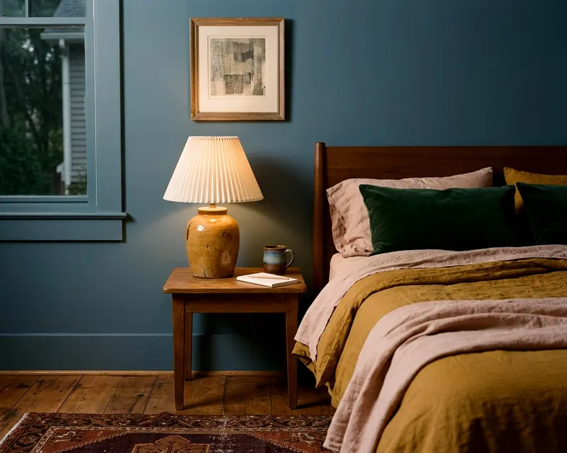
The best bedroom paint colors look rich and inviting under the warm glow of a bedside lamp. Daylight shows the true color of the paint, but evening light can change the undertones. Judging a color at night helps keep your walls from looking muddy or cold after dark.
Understanding how paint reflects light
The paint industry measures how much light a color bounces back into the room to predict how dark the walls will feel. What makes a wall feel like a cave at night? It comes down to a simple number on the back of the paint swatch. Sherwin-Williams describes light reflectance value (LRV) on a scale from 0, which absorbs all light, to 100, which reflects all light.
A bright white scores high. A black wall sits near zero. High numbers keep a room feeling airy when the sun goes down. Low numbers soak up the lamplight and create a dark effect.
A middle value balances the two extremes. It gives the walls enough depth to look rich without making the room too dark. Sherwin-Williams says its color chips list the LRV on the back. Check this number before you buy a sample.
A low LRV may mean you need more lamps to see clearly in the bedroom. A high LRV means the walls will brighten up quickly when you flip the light switch.
Soft warm whites and creams
A bright white wall can feel harsh under a ceiling light. Warm whites and creams offer a softer background for evening routines. These shades have subtle yellow or brown undertones. The lamp picks up those warm notes and amplifies them.
The walls glow softly.
A cream paint keeps the space feeling light. The headboard stands out clearly against a cream wall. The bedding looks crisp and clean without feeling sterile.
Add a heavy wool throw to the foot of the bed. The texture warms up the plain walls. Try testing these shades against a piece of plain white printer paper. The paper helps you see just how much yellow or peach the cream holds.
A cream that looks almost white in the store might look very yellow next to your bed. Keep the trim a simple pure white to frame the creamy walls nicely. This makes it easier to build one color palette for the rest of the house.
Muted greens from sage to olive
Bedroom paint ideas often include green to bring the outdoors inside. Choose muted tones over bright ones. A soft sage or a rich olive works better than a vivid emerald.
Lamplight adds a yellow cast to the walls. Yellow mixed with a bright green can look neon and jarring. Yellow mixed with a gray green makes the wall look warm and grounded. The muted green feels restful at night.
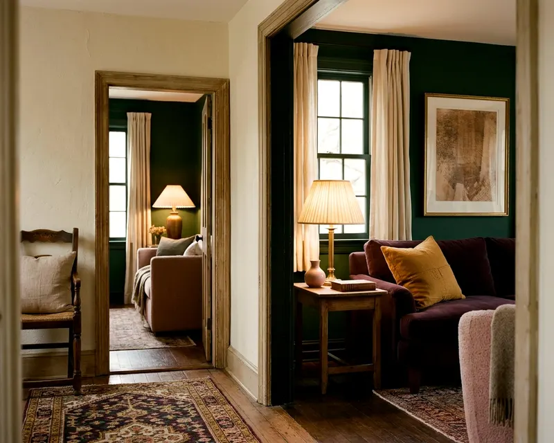
A dark olive wall looks almost brown under dim light. It wraps the room in a quiet shadow. The floor lamp casts a wide circle of light on a green wall. The color holds its shape without looking sickly.
Pair a sage wall with dark walnut furniture. The green highlights the rich brown grain in the wood. Sage green acts as a gentle backdrop for wood furniture and brass hardware. The gray undertones keep the color from overwhelming the small space of a bedroom.
Dusty blues and blue grays
Blue is a classic choice for a bedroom. It brings a calm feeling to the space. Pure blues can feel icy when the sun sets. Look for dusty blues and blue grays instead.
These colors have a touch of gray or black mixed in. The gray stops the walls from looking like a nursery. Do you want a cool and restful space? Warm light from a bedside lamp softens a cool dusty blue.
The room feels balanced rather than freezing. A dusty navy or a pale slate blue acts as a strong backdrop for heavy wooden dressers. The blue contrasts well with crisp white sheets.
The window drapes frame the blue walls and add softness to the hard edges of the room. A gray blue wall makes white window trim pop. The contrast looks sharp during the day, then softens nicely at night. This helps a room feel calm and pulled together.
Blush, plaster pink and terracotta
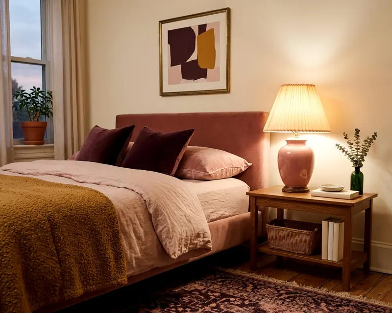
Pink walls do not have to look childish. Bare plaster and clay tones create a mature atmosphere. These earthy pinks thrive under incandescent light. The yellowish lamplight deepens the pink and makes the whole room feel warm.
A pale blush acts like a neutral. It warms up a dark room without stealing attention from the furniture. The rug anchors the room when the walls are painted a warm pink. A cream or beige rug blends perfectly with blush paint.
Terracotta brings serious color and weight to a space. The heavy red and brown tones look rich and grounded when the main light goes off. A terracotta wall looks like baked clay under a warm bulb. It feels welcoming and cozy.
Terracotta walls look striking behind a simple wooden bed frame. Pair these pinks and reds with natural linen and wool blankets. The textured fabrics catch the shadows and highlight the warm tones in the paint.
Deep moody shades like aubergine and navy
Dark colors make a bedroom feel like a quiet retreat. Aubergine, charcoal and deep navy soak up the light. They blur the corners of the room. The space can feel larger because you cannot easily see where the walls end.
These shades need good lighting to work well. Place a brass lamp against a dark navy wall. The metal catches the light and stands out sharply. A deep purple or aubergine looks dramatic and soft at the same time.
Paint the baseboards the same dark color to keep the walls looking tall. The ceiling feels higher when the dark walls blur the corners. Add a large mirror to a dark wall to bounce the lamplight back into the room.
A dark charcoal gray provides an excellent background for framed art. The white mats inside the frames glow against the dark paint. Use a flat finish to keep the dark walls looking velvety rather than shiny.
Choosing by room direction and testing bulbs
The direction your windows face changes how paint looks during the day. Do your windows face east or west? Sherwin-Williams says east facing rooms get warm light in the morning and cool light toward evening, while west facing rooms are the reverse.
An east facing room makes blue look very cold by the time you go to bed. The natural light fades into a cool gray shade. A south facing room gets bright warm light all day long. A north facing room gets the least light, with a cool cast that can make warm colors look dull.
Your lamps matter just as much as the sun. Buy your bulbs before you pick a paint color. ENERGY STAR describes bulbs in the warm range (Soft White, Warm White) as ideal for most indoor applications, with lower Kelvin giving warmer, yellowish light.
It determines what light color temperature fills your bedroom. A warm bulb can turn a crisp gray into a warm beige. Paint a square of your top three colors on a board. Move the board around the room after dark.
Turn on your actual lamps.
Preparing the room and checking for lead
Prepping the walls takes time before you can open a paint can. Older houses carry specific risks. The EPA says homes built before 1978 are more likely to have lead based paint, and its guidance is to hire a lead safe certified contractor rather than remove it yourself.
Peeling paint in a home built before 1978 needs a lead check and professional attention before any sanding. Even safe modern paint needs good airflow. The EPA says paints contain organic solvents and advises increasing ventilation when using products that release VOCs.
Open the bedroom windows wide. Set a box fan in a window facing out to push fumes outside. Wash the walls with a mild soap to remove dust and oils. Paint will not stick to a greasy wall.
Allow the walls to dry completely. A clean surface ensures the paint rolls on evenly. Fill any holes and sand them smooth, but only after lead is ruled out in a home built before 1978. A flat wall makes the final color look rich under the lamps.
Take off the light switch covers and lay drop cloths over the floors. Apply two coats of color to get the true depth shown on the paint chip. The second coat covers the patchy spots and brings out the undertones. Good preparation leaves a clean edge around the trim.