How a triad color scheme works without turning loud
A triad color scheme uses three colors spaced evenly on the color wheel to give your room a balanced and lively look without feeling too loud.
- Styled by Kellan Langley
- 8 minute look
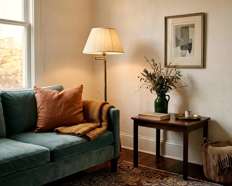
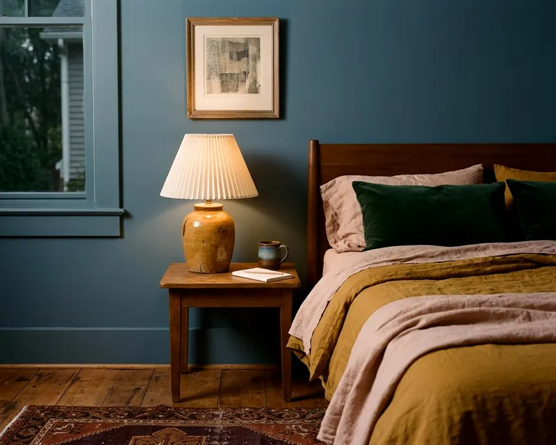
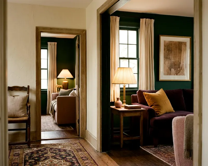
A triad color scheme uses three colors spaced evenly around the color wheel. You get a space full of life that still feels balanced. The trick is avoiding pure primary shades. You pick one dominant color and let the other two act as soft accents.
Finding a triad scheme on the color wheel
Draw an equal triangle on a standard color wheel, and the three points touch your triadic scheme. Red, blue and yellow make up the most famous set. Orange, green and purple form the secondary triad, while the wheel offers many variations between these anchor points.
These combinations work because the spacing builds high contrast. Each hue stands completely apart from the others, giving your room an immediate sense of visual energy. You get a lively space.
The color wheel shows you pure hues. A room painted in pure red, blue and yellow feels aggressive. You want a welcoming home, not a fast food dining room. You must adjust the lightness and darkness of these points to make them livable.
Muting the triad with tints and shades
You soften a loud triad by mixing black, white or gray into the pure colors. Tints add white to make a hue lighter. Shades add black to make a color darker, while tones add gray for a muddy and complex finish.
Take the classic primary triad, where pure red, yellow and blue feel sharp on the eyes. You can adjust them down. Red becomes a soft terra cotta while blue deepens into a dark navy. Yellow turns into a pale mustard, keeping the high contrast intact while the shouting stops.
Look at the secondary triad of orange, green and purple. You can dial pure orange down to a soft peach, and green becomes a deep olive. Purple softens into a dusty lilac for a mature and grounded feel. You still use the triad structure, but you just change the volume of the colors.
Darker shades anchor a space. Lighter tints make a room feel open. You mix them to build depth.
Letting one color lead and two support
Equal amounts of three colors create a chaotic room. Your eye needs a quiet place to rest. You must let one color dominate the space, leaving the other two colors to play supporting roles.
Choose your favorite hue from your triad. This color will cover the walls, the large rug or the main furniture. It sets the mood for the entire room.
Pick the second color for medium pieces. The sofa, the drapes or a large accent chair take this shade. It breaks up the dominant color with clear visual interest.
Save the third color for small touches. The lamp, the throw pillow or the artwork provide tiny punches of contrast. This third shade acts like a spark. It keeps the palette from feeling flat.
The process of building one color palette takes patience. Let the dominant color cover the most visual space, and let the secondary color fill a smaller supporting area. The accent color takes whatever is left, which keeps the room firmly grounded.
Placing the three colors across one room
You have your colors and your ratio planned out. Now you spread them around the room. Do not clump all the accents in one corner. Spread the supporting hues so your eye travels naturally across the space.
Start with the largest surfaces, since the walls and the rug usually take the dominant color. A soft peach wall warms up a cool space. A large peach rug anchors the floor, making the room feel instantly unified.
Add your secondary color through upholstery and window treatments. A soft sage sofa sits on that peach rug. Sage green drapes frame the windows to carry the color up the wall. The green breaks up the peach naturally.
Drop the third color in through small accessories. Dusty purple throw pillows rest on the sage sofa. A purple ceramic vase sits directly on the coffee table. The third color pops against the other two hues.
If the room feels heavy on one side, move a purple pillow to the opposite chair and shift a green blanket to a different wall. Balance the visual weight across the floor plan so the colors look woven together.
The task of starting from a bare floor helps you see the balance clearly. You can layer the colors one by one until the room feels right.
Using patterns to tie the triad together
Solid colors make a bold and simple statement. Patterns do the heavy lifting when you want a room to feel cohesive. A patterned piece bridges the gap between your three distinct hues.
Find a textile that contains all three of your triad colors. A large floral rug or a geometric throw pillow shows the eye that these colors belong together. The patterned piece acts like a visual map for the room.
The rug often provides the best anchor. You lay down a Persian rug with shades of rust, navy and mustard. The walls take the pale mustard tint while the sofa gets the deep navy fabric. Small rust accents sit quietly on the bookshelves.
Drapes offer another broad canvas for pattern. Floral drapes framing a large window pull the palette up from the floor. You keep the upholstery solid to avoid visual clutter. The patterned drapes carry the interest.
How wood floors and metals fit the scheme
You might worry that a brown wood floor ruins your strict three color plan. Wood floors, white ceilings and gray sofas act as neutral backgrounds. They do not count toward your triad.
Wood brings warmth to a cool color scheme. A dark walnut coffee table sits quietly among mint green, soft peach and pale periwinkle. The brown wood gives the eye a break. It grounds the airy colors naturally.
Metals work the same way. Brass, iron and polished nickel disappear into the background of a colorful room. A brass floor lamp warms up a slate blue corner. Black iron hardware adds crisp borders to bright yellow kitchen cabinets.
Treat your neutrals as the stage, leaving the triad colors to act as the main stars. Bring in plenty of white, cream or pale gray. A white ceiling stops a colorful room from feeling like a cave.
Triads that suit specific rooms
Different rooms ask for different energy levels. You can shape a triad to fit the exact function of the space.
The living room
Living spaces handle complex tones very well. You want a welcoming mood that works in daylight and by artificial lamplight.
Try a muted split of orange, green and purple, picking a warm rust for the dominant color. Textured rust wallpaper wraps the room in warmth. Bring in a dark forest green velvet sofa and add a few faded plum throw pillows to the seats. The room feels rich and cozy.
Another strong option uses blue, yellow and red. A pale slate blue covers the walls, and a deep ochre rug warms the bare floor. Small burgundy accents dot the tall bookshelves. The space stays relaxed but interesting.
The bedroom
Bedrooms need calm tones above all else. High contrast can feel too stimulating for sleep. You want light tints and deep shades here.
Consider a soft version of the primary triad, starting with a pale butter yellow on the walls. Bring in a navy blue upholstered bed frame and use soft brick red tones in the bedding pattern. The dark blue grounds the airy yellow, and the red adds just enough warmth.
You can also use a quiet secondary triad. A pale mint green dominates the space, and soft peach sheets add delicate warmth. A dark eggplant table lamp sits heavily on the nightstand. The room feels light and fresh.
The trick to what makes the room feel calm relies on keeping the tones dusty and soft. Avoid any pure, bright hues near the bed.
The kitchen
Kitchens handle bright colors well. The cabinets and counters break up the solid wall space. You can push the saturation slightly higher in a cooking space.
Look at yellow, blue and red to wake up a dull space. Paint the lower cabinets a deep teal and leave the walls a warm, creamy off-white. Add a bright lemon yellow runner rug and place a glossy cherry red espresso machine on the counter. The kitchen feels cheerful and active.
You might prefer green, orange and purple. Olive green cabinets anchor the room while a burnt orange Roman shade hangs at the window. A deep aubergine fruit bowl sits on the island. The look remains earthy and warm.
Mistakes that make three colors feel childish
Triad palettes often fail in the early planning stage. People use colors straight from the hardware store paint chip. The room ends up looking like a loud playroom.
Never match the saturation of all three colors. If all three hues are equally bright, they fight for attention and make the room vibrate uncomfortably. Mix a dusty tone with a dark shade and a pale tint. Contrast in lightness matters just as much as contrast in actual color.
Do not skip neutral tones. A triad scheme still needs white, gray, black or wood tones to give the eyes a break. A room with only red, blue and yellow feels overwhelming.
Avoid pure primary colors outside of kids rooms, since fire engine red, sunshine yellow and royal blue look stark. Shift them slightly by turning the red toward pink or brown. Push the yellow toward green or orange, and muddy the blue with gray.
If your colors are too bright, add a gray glaze or pick a grayer paint swatch. Gray tones take the sharp edge off any loud hue.
Testing the colors in your actual light
You need to see the three colors together in your room. Hardware store lighting changes how a color reads. Your home has unique natural light that alters every tone.
Gather physical swatches before you buy anything, including paint chips, fabric squares and rug threads. Lay them out on a white piece of paper to look at them in the morning sunlight. Check them again under warm evening lamps.
Notice how the colors react to each other. The accent color might pull out unwanted undertones in the dominant shade. A purple pillow might make a green sofa look sickly. Swap out the offending swatch for a slightly warmer or cooler version.
You will need a few common items to check your palette:
- Physical swatches of your three chosen colors
- A large sheet of plain white poster board
- Painter tape to hold the swatches in place
- A standard lamp with the bulb you intend to use
Trust your eyes when you review the swatches. Swap out any shade that feels too bright until the whole group reads softly together.