Does color psychology hold up when you pick paint for a room
Learn how color psychology works when picking paint, how light changes a room's mood, and how to use color associations for a beautiful home.
- Styled by Kellan Langley
- 8 minute look
Color psychology gives you a helpful starting point when you pick paint, but it is not a strict science. A room painted deep red will likely feel warmer and more active than a pale blue room. Your own memories and the natural light always override generic rules about how a shade should make you feel.
How color psychology works in a house
People use color psychology as a shorthand for the mood a room creates. The basic idea suggests that certain shades trigger specific emotional responses. Reds and yellows supposedly bring energy, and blues and greens supposedly bring calm. You will hear these rules often when you plan a decorating project.
The psychology of color in home design rests on associations we pick up from the physical world. We associate blue with open skies and calm water. We connect yellow with bright sunlight, and green reminds us of healthy plants and outdoor space. Brown feels solid like earth and natural wood.
These associations give you a practical vocabulary to talk about paint. You can tell a friend you want a restful bedroom or a lively kitchen. Knowing which shades traditionally match those moods helps you narrow down the paint chips at the hardware store. It saves you from staring blankly at hundreds of minor variations.
Interior designers rely on these concepts to establish harmony. They often find a cool gray bedroom gives a visual break after a long day. They also find a warm yellow entryway feels welcoming. These professional tricks are easy to borrow for your own walls.
A color alone cannot force you to feel a certain way. You might find a bright yellow kitchen cheerful, while someone else might find it harsh. Cultural backgrounds and personal memories shape our reactions strongly. You can use the traditional meanings as a guide rather than a rulebook, because the goal is to build an environment that supports your daily routine.
How warm and cool colors change a room
The color wheel splits into warm and cool halves. The warm side includes red, orange, yellow and brown. The cool side holds blue, green, purple and gray. Each half alters how you perceive the physical space around you.
Warm tones often seem to advance toward the eye, so a wall painted burnt orange can seem closer than it is. This effect can make large rooms feel intimate. Many people also say warm colors make a room feel warmer. You might prefer these shades in a room that feels drafty or lacks natural sunlight, since a deep terracotta can make a large basement feel like a comfortable den.
Cool tones often seem to recede from the eye, so a ceiling painted pale blue can look higher. Cool colors can seem to push the walls outward. This visual trick can help a tight room feel open and breathable. A cool palette often feels refreshing in a space that gets hot afternoon sun.
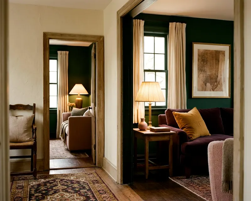
You can mix temperatures to balance a room. A room painted entirely in icy blues might feel stark and uninviting, but a warm wood floor grounds the space and brings the temperature back to comfortable. You can build one color palette for your whole house by playing with these balances from room to room. A warm hallway can lead beautifully into a cool, airy living space.
Why light and size alter the mood
Natural light changes how any paint color feels. A color that looks vibrant on a screen might look dull on your wall. The direction your windows face dictates the quality of light the room receives. You cannot separate a paint color from the light that hits it.
North-facing rooms receive weak, indirect light that brings out the gray and blue undertones in paint. A pale gray that looks crisp in a sunny room will look chilly in a north-facing space. You often need warmer undertones to keep a dim room from feeling dreary. A cream with a hint of yellow fights off the gloom.
South-facing rooms flood with strong, golden sunlight. This intense light washes out pale colors and makes warm colors look much brighter. A soft yellow paint might turn glaringly bright by mid-afternoon. Cool colors thrive in these sunny spaces because the warm sunlight softens their icy edge.
You also have to consider what sits outside the window. A large green tree right outside a south-facing window can bounce green light onto your walls. A red brick neighboring house can cast a pink glow into your room. These exterior reflections alter the psychological mood inside the room.
Artificial light changes the room again after dark. Bulbs cast their own color tone. A warm light bulb turns a crisp white wall slightly yellow. You can read about what light color temperature to use in each room to control how your paint looks at night.
The finish of the paint matters just as much as the shade. Glossy paint bounces light around and feels active. Flat paint absorbs light and feels quiet. A dark glossy blue feels dramatic, while a dark flat blue feels soft like velvet.
Room size influences how intense a color feels over time. A dark navy blue might feel grounding in a tiny powder room. That same dark navy could feel heavy and oppressive across a vast open-plan living space. You have to consider the sheer square footage of color your eyes will take in.
Matching colors to how you use the room
Certain palettes naturally support quiet activities. Bedrooms, bathrooms and reading spaces usually benefit from a restful approach. People lean heavily on greens, blues and soft earth tones for these private spaces.
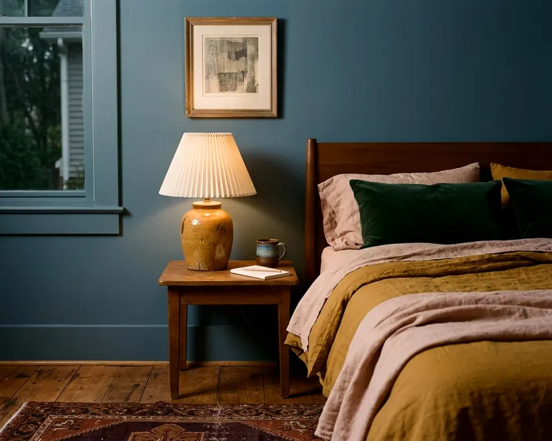
Many people find green easy on the eyes. A soft sage green bedroom feels restorative to many people, and blue is often chosen for its relaxed feel. You might want bedroom paint colors that still look good by lamplight while keeping the mood serene. Soft warm neutrals like beige or taupe also work well because they remove visual distractions.
Social spaces call for a different energy. Dining rooms, kitchens and family rooms often host conversation and activity. Warm, saturated colors support this lively mood.
Deep red dining rooms remain a classic choice. Red often feels lively and can make a dinner party feel like an event. Yellow works well in kitchens because it suggests daylight and cheerfulness, especially on dark winter mornings.
Home offices need a balance of focus and energy. Many people choose muted greens or blues to stay calm during stressful work. Others prefer a warm, earthy orange to keep their energy up. Think about whether your work requires quiet concentration or creative brainstorming.
Even a rich, warm brown can make a large living room feel like a gathering space. If you prefer cool colors in a social room, you can choose saturated versions. A vibrant teal brings more energy than a pale sky blue. The saturation level changes the impact.
Where color psychology goes too far
You will read many exaggerated claims about paint colors. Some guides suggest a yellow room will make people lose their temper, while others promise a blue room will cure insomnia. These broad statements ignore how complex human beings are. A coat of paint is not medicine.
Marketing materials often oversimplify color psychology, because some paint marketing sells a lifestyle along with a shade. A paint named for a peaceful morning will not fix a chaotic routine. The color sets a background, but it does not control your behavior. Do not let aggressive marketing dictate your design choices.
Personal experience always beats generic advice. You might hate a popular calming green because it reminds you of a waiting room, or you might love a vibrant orange because your grandmother had an orange kitchen. If a color makes you happy, you should use it. You do not need to worry that it breaks a psychological rule.
Cultural background plays a heavy role in how we see color. White is linked with purity in some cultures and with mourning in others. Red means danger in some places and good luck in others. No color has a universal, hardwired meaning for every human on earth.
How to test the mood of a paint color
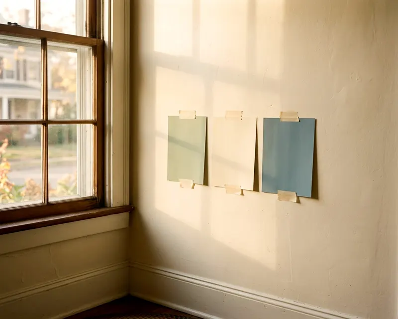
You cannot judge a paint color by looking at a tiny paper square in a store. The bright store lighting looks nothing like your home. You need to see the color in your actual room to know how it feels.
Testing a paint color properly takes a little patience. You can follow these steps to see how a shade really behaves:
- Buy small sample pots of the colors you want to try.
- Paint large squares onto white poster board instead of your walls.
- Leave a wide white border around the edge of each board.
- Move the painted boards around the room throughout the day.
- Observe the boards under artificial light after the sun goes down.
Your current wall color will trick your eye if you paint a sample directly over it. A white swatch looks dingy against a bright yellow wall. The poster board isolates the new color so you can see it clearly.
Testing colors on different walls gives you a complete picture. A color might look perfect near the window but turn muddy in the shadows near the floor. You want to spot these changes before you buy gallons of paint.
Live with the swatches for a few days, and notice how you feel when you walk into the room. Notice whether the dark green feels cozy or like a cave, and whether the bright white feels clean or sterile. Pay attention to your gut reaction rather than what a magazine says you should feel.
Look at the other items in the room, because the paint needs to work with your floor, your furniture and your drapes. A soft blue wall might clash with a warm red sofa. The overall mood comes from how all the pieces interact. Trust your own eye above any color theory.