Maximalist decor that looks collected rather than cluttered
Build a maximalist decor style that looks collected rather than cluttered using a steady color thread, scaled patterns, and grouped objects.
- Styled by Kellan Langley
- 9 minute look
Maximalist decor relies on intentional abundance. You build it with a steady color thread, scaled patterns, and grouped objects. The goal is a rich room that feels deliberate. Every piece must play a distinct role.
The difference between a maximalist room and a cluttered one
Maximalism embraces strong colors, varied textures, and abundant art, rather than acting as an excuse to leave things everywhere. A collected room has a clear structure underneath the layers. The stacked books and throw pillows match a specific palette. A cluttered room lacks that underlying frame.
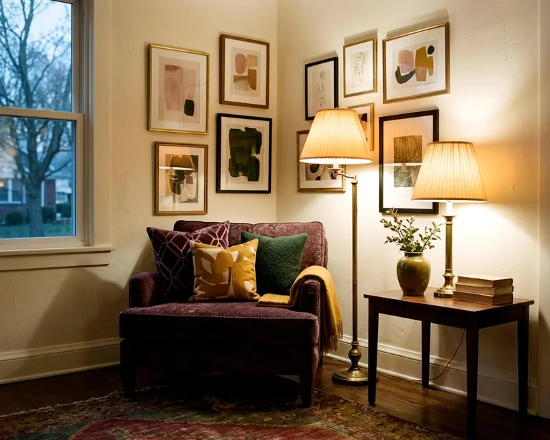
Every item in a maximalist space earns its keep. You arrange things with care, moving a piece somewhere else if it fails to add to the color scheme. The velvet chair, the brass lamp, and the stacked art books should look like they belong together.
On flat surfaces, a messy home has receipts and empty cups sitting on the side tables, while a maximalist home has heavy books and ceramic vases in those exact same spots. The sheer number of items might be similar, but the intention behind them is completely different. You put the vase there because it catches the afternoon light.
A messy room happens by accident when you drop the mail on the table and leave it there. A maximalist room happens on purpose. You place a brass bowl on the entryway table specifically to catch the daily mail so the scattered paper looks like it belongs. Guests should see a space that makes visual sense.
Rely on a strict color palette to organize the chaos
A wild mix of furniture and art needs a strict color palette. You can have a green velvet sofa, a pink Persian rug, and blue walls. That works if you repeat those exact shades. A room falls apart when it has a dozen different colors fighting for attention.
Start by pulling a color scheme from one large item. A large area rug might have deep navy, mustard yellow, and rust red in its weave. Use those three colors as your thread to paint the walls navy and find rust red throw pillows. You can then place a mustard yellow throw blanket on the sofa.
This steady repetition helps a busy room read as planned. You might even want to build one color palette for the entire home to keep the style consistent from room to room. When you shop for a new vase, you check it against these colors. If it clashes, you leave it on the shelf.
Stick to a strict color ratio. Let one dominant color cover most of the room, a job the walls and the large area rug usually take. Give a medium amount of space to your secondary color through the sofa and long drapes. Save just a few small spots for your brightest accent color, using lamp bases and small art prints.
Metals act as colors too. Brass, chrome, and matte black bring their own visual weight to the room. If you use brass on the lamp bases, use brass on the cabinet hardware as well. This adds another subtle layer of repetition.
Combine different patterns by changing their scale
Combining stripes, florals, and geometric prints is a core part of the maximalist aesthetic. The trick is to strictly manage the size of every pattern you bring into the space. If every print is the exact same size, the patterns will compete and confuse the eye.
Vary the scale by putting the largest pattern on the largest surface in the room. A massive area rug is a great foundation for a sprawling floral print. Use medium patterns on your furniture, like an accent chair wearing a bold stripe. Finish with small patterns on the accessories so the throw pillows feature a tiny geometric design.
Varying the scale creates depth. The big floral rug anchors the floor while the striped chair provides structure. The detailed pillows pull you in for a closer look. They all work together because they do not fight for the same visual territory.
Mix organic shapes with rigid ones. A floral pattern features soft, curving lines, and a stripe features hard, straight lines. They look good next to each other because they do completely different things. A curved floral pillow softens a hard striped chair, whereas two floral prints side by side just blend into one busy blob.
Give the patterns some solid ground to stand on. If you have patterned wallpaper and a patterned sofa, they need a buffer. A solid dark blue pillow on the patterned sofa creates a necessary break, just as a plain wood side table separates the loud chair from the loud rug. The solid colors act as fences between the busy prints.
Group small objects into solid visual blocks
Ten separate items scattered across a table look messy. Those same ten items gathered on a brass tray look like a deliberate collection. Grouping is how you manage abundance in a room.
The coffee table needs boundaries. A wooden tray corrals the remote, the coasters, and a heavy glass candle, acting as a frame that turns loose items into a single visual block. You can do the same thing by stacking large art books on the side table. Place a small stone sculpture on top so the books act as a pedestal.
The bookshelf requires structure too. You want to style a bookshelf by grouping items by color or size. Place several tall blue vases together on the top shelf and stack art books horizontally on the middle shelf. Grouping creates visual blocks that are easy to take in.
The fireplace mantel is a classic maximalist display area. You can fill it completely, but you still need a structure. Put a large framed painting right in the center and flank it with a pair of tall metal candlesticks. Fill the remaining gaps with small ceramic bowls, using the symmetrical arrangement to keep the items looking neat.
Use odd numbers for your small groupings. A group of three items feels natural and balanced, whereas a pair often looks rigid. The brass candlesticks, the low bowl, and the small framed photo form a triangle that pulls the loose items into a single unit. This keeps the flat surfaces feeling organized.
Leave clear borders when you layer rugs and art
Layering adds warmth and texture. You can put a smaller patterned rug over a large natural jute rug. You can hang a gallery wall that spans from the baseboard to the crown molding. But you must leave some boundaries visible.
The floor needs a clean edge. If you layer a smaller vintage rug over a large jute rug, leave a clear border of bare wood floor showing around the room edges. That empty border frames the layered rugs and proves the floor is actually there. The jute rug frames the patterned rug, making the layered look feel intentional because the borders are obvious.
The walls need breathing room too. A gallery wall packed with many pieces of art is a beautiful thing, but you must keep the spacing consistent. Leave an even gap between every single frame. The tight, consistent spacing turns random pictures into one large rectangle.
Do not cover every single wall in the room that way. Give the main wall the heavy art treatment and leave the opposite wall bare, or hang just one large mirror. The mirror reflects the art without adding more busy patterns. You could hang a decorative wall mirror opposite a window to bounce more light around so the room feels full but not heavy.
Give the brain a break with empty physical space
A dense room requires negative space. Negative space is just an empty physical area. Without it, the room can feel tiring to look at. You need a few quiet spots to balance out the loud, heavily patterned sections.
The solid color sofa is a great resting place. If the rug is a loud floral and the walls feature busy wallpaper, the sofa should be a solid block of color to break up the prints. A navy blue velvet sofa gives the eye a natural place to pause. Solid drapes do the exact same thing, so hang plain linen drapes if the walls are busy.
Leave a corner empty. The armchair and the side table take up one corner, and the tall potted fig tree fills another. Let the third corner just be empty space because you do not need to fill every inch of the floor plan. The empty corner makes the filled corners look intentional, highlighting your bold design choices.
A plain white ceiling is a big expanse of empty space even if you paint the walls dark green and hang bright art everywhere. A white ceiling often helps the room feel open. The eye can always travel upward to find a calm, blank surface.
Keep the window glass clear. Do not block the natural light with tall plants or heavy furniture. The bright light from outside gives the eye a visual break and helps keep dark, rich colors from feeling heavy.
Spread the heavy furniture evenly across the room
Maximalist rooms often hold a lot of furniture. You have to spread the heavy pieces out. If you put the dark leather sofa, the solid wood bookcase, and the heavy trunk all on the same side, the room can look lopsided.
Mix heavy pieces with light pieces. The heavy leather sofa needs a delicate partner, so place a glass coffee table in front of it that takes up almost no visual space. The dark wood bookcase needs a light chair nearby. A chair with thin metal legs balances the thick wood shelves.
Vary the heights of your furniture. The sofa is low to the ground and the coffee table is lower, so you need tall things to draw the eye up. A tall floor lamp adds height without adding bulk, while a massive indoor tree pulls the eye toward the ceiling. When the eye moves up and down naturally, the room feels energetic.
Spread the color weight too. If you have a bright red chair in one corner, put a red pillow or a red painting in the opposite corner. This creates an invisible diagonal line across the room. The eye follows the line and the room feels more ordered.
Fabrics carry weight as well. A velvet armchair often looks heavier than a linen armchair of the same size. Spread the heavy fabrics around the space. If you have a massive velvet sofa on one side, put a heavy wool rug on the other side to create a balanced room that feels steady on its feet.
Edit the finished room to remove the final distractions
Maximalism still requires a ruthless edit. You build the room up, layer by layer, until it feels almost too full. Then you take one or two things away.
Stand in the doorway and look at the space. If the room lacks balance, move a heavy wooden cabinet to counter a large, dark sofa. If a table is overcrowded, take away the smallest item.
Take a photo of the room with your phone because a photograph flattens the space. It forces you to see the room as a stranger would. The photo can show you if a shelf is too crowded or if the art is hung too high. Fix the mistakes the camera reveals.
You do not have to display every item you own all at once. Put your extra pieces in a closet, and when you get tired of the blue ceramic vase, swap it out for the brass bowl. Rotating your collections keeps the room feeling fresh. It prevents the flat surfaces from becoming a parking lot for everything you have ever bought.
Look at the room again after a week. The pieces that still bother you then are the ones to move or put away.