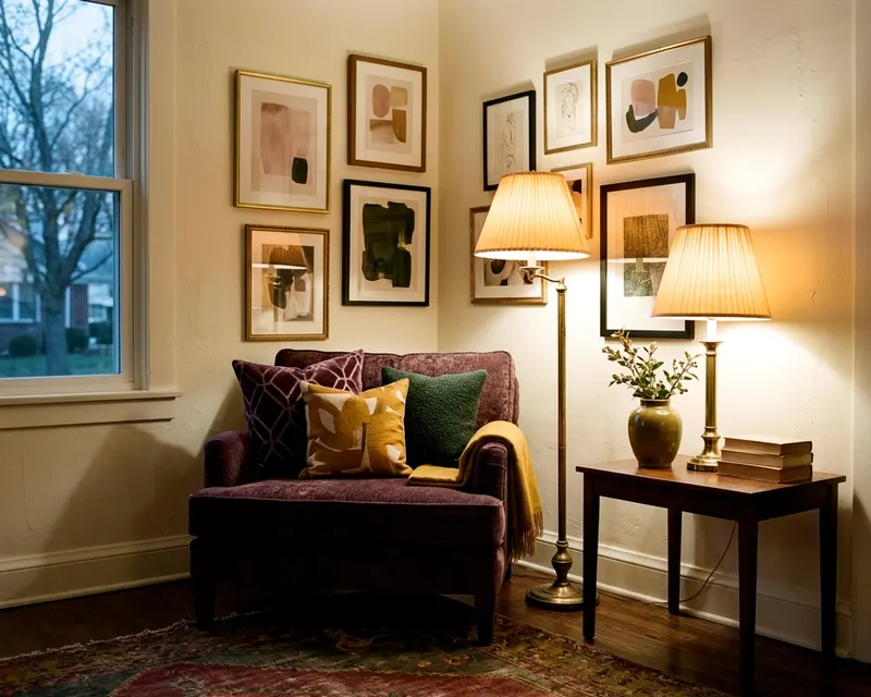
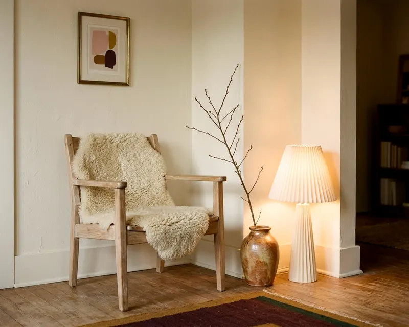
8 French country decor touches that feel relaxed and real
Get authentic French country decor in your home with eight specific touches, from painted wood furniture to a soft color palette and aged metal finishes.
- Styled by Kellan Langley
- 7 minute look
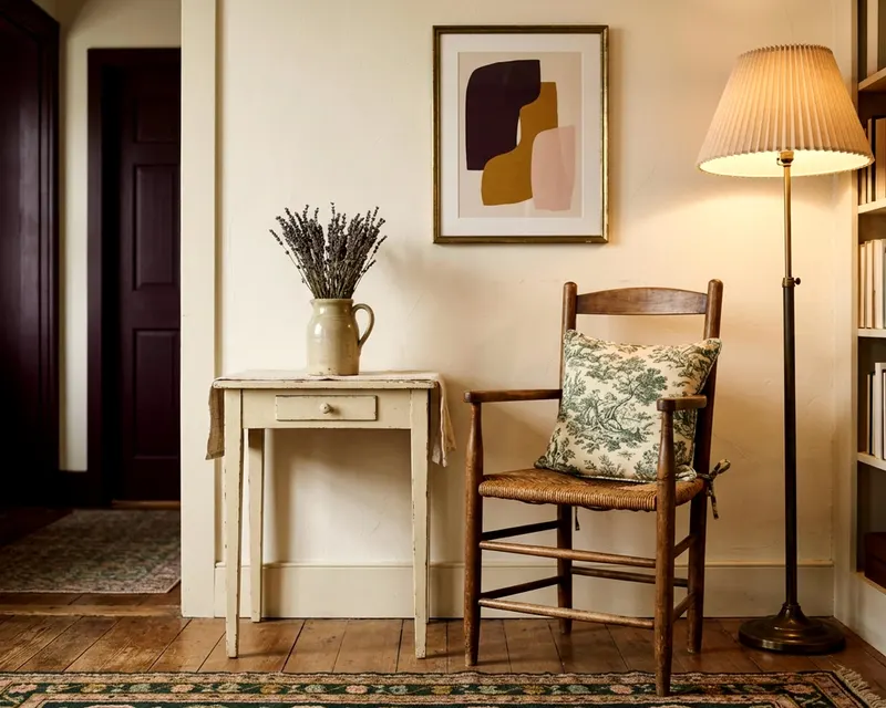
True French country decor relies on practical materials that show signs of gentle use over time. You create this look with muted colors and painted wood instead of a matching furniture set. A few deliberate choices bring the style into an American home without feeling like a stage set.
1. Painted wood furniture with gentle wear
The dresser or dining table anchors the room. French country style favors wood furniture painted in pale gray, soft white or muted green, showing slight wear around the edges and drawer pulls. This suggests a piece that has served a family for generations. If you want to introduce this style to your bedroom, consider replacing your matching modern nightstands with two different vintage tables painted in the same soft gray.
A chalk paint finish works well for this effect. You can apply it to a thrift store sideboard or a plain wooden nightstand. Rub the dry paint lightly with fine sandpaper around the corners and handles where hands would naturally touch the furniture. The exposed wood underneath adds immediate warmth to the room.
Do you want to avoid painting? Look for pieces with a dull, waxed finish rather than high gloss varnish. A raw oak dining table fits perfectly if the wood looks scrubbed and matte. You can easily mix one painted cabinet with a natural wood table.
2. Toile, checks and faded floral fabrics
The fabrics in the room tell a clear story. Toile de Jouy features scenic patterns printed in a single color on a light background. You often see pastoral scenes in red or blue on cream cotton. Use toile on a single accent chair or a set of drapes to draw the eye immediately.
Gingham checks and faded floral prints balance the busier toile. A red and white check throw pillow looks right at home against a solid linen sofa. Keep these patterns confined to one or two textiles in the room. Too many competing prints can make the space feel crowded.
The scale of the pattern matters. Mix a large toile print on the drapes with a small check on the cushions. This visual distance keeps the patterns from fighting each other. Read how to get bedroom decor that makes the room feel calm if you need help balancing busy prints.
3. A soft palette of cream, ochre and blue
The wall color and major fabrics need a muted foundation. Brilliant white looks too harsh for this style. Choose warm cream, soft blue gray or mustard ochre for your primary surfaces. These colors mimic the natural dyes and plasters found in older rural homes, absorbing light rather than reflecting it sharply.
Faded red makes a strong accent color. A terracotta lamp base or a brick red throw blanket adds warmth to a blue gray room. The colors should look as if they have faded in the sun. A bright cherry red will clash with the softer tones.
You can build this scheme across the house. Paint the living room a dusty blue and use a soft ochre in the kitchen. Read how to build one color palette for your whole home to keep the look consistent. Keep your base colors soft and save the darker reds and blues for small accents.
4. Rush seat chairs and curved wooden legs
The dining chairs or occasional seats add texture. Rush seating uses twisted grass or paper cord woven across the chair frame. The natural rough texture breaks up smooth painted wood and soft fabrics. You will often see this material on ladder back chairs or low wooden stools.
Furniture profiles favor curves over sharp right angles. The legs on a console table or a footstool gently flare outward. This cabriole leg shape brings a slight elegance to otherwise basic wooden furniture. It keeps practical wooden pieces from looking heavy and rigid.
You do not need a full matched set of dining chairs. Put two rush seat chairs at the head of a wooden table. Use simple painted chairs for the sides. This mismatched approach looks collected over time.
5. Copper, brass and aged iron hardware
The metal finishes should lack any modern shine. Bright chrome and polished nickel belong in a different house. Look for aged iron curtain rods, unlacquered brass cabinet knobs and dark copper light fixtures. These metals develop a dark patina that grounds the softer colors in the room.
A heavy iron chandelier or a copper wall sconce draws the eye. The metal provides a dark contrast against cream walls and pale painted furniture. You can easily swap out modern drawer pulls for oil rubbed bronze hardware. This simple swap makes a plain dresser fit the style in an afternoon.
Pay attention to the light bulbs you put in these fixtures. A stark white bulb ruins the antique feel of an aged brass lamp. Use a warm white bulb to cast a soft, yellow light. The warmer light enhances the cream and ochre tones in the room.
6. Heavy linen for bedding and upholstery
The bedspread or sofa cover needs visual weight without stiffness. Thick natural linen drapes beautifully, wrinkles naturally and resists looking fussy. This casual draping fits a style that values comfort over rigid perfection.
Use unbleached linen for drapes, tablecloths and throw pillows. The oatmeal color coordinates perfectly with toile patterns and muted wall colors. Linen wears well and softens with every wash. A heavy linen slipcover on a modern sofa instantly shifts the room toward a country aesthetic.
You can mix linen with soft cotton for variety. A linen duvet cover pairs well with crisp cotton sheets. The contrast in textures keeps the bed looking interesting. Hang linen drapes high above the window frame to make the ceiling feel taller.
7. Dried lavender and subtle botanical touches
A small pitcher of dried lavender on a side table quietly gives the room a connection to the outdoors. The scent and the pale purple color add life to a quiet corner. Keep the botanical elements small and purposeful. Avoid anything that looks plastic or overly arranged.
Massive floral arrangements look too formal. Place a few dried wheat stalks in a ceramic jug or a single leafy branch in a clear glass vase. The goal is to suggest a few clippings brought in from the yard. Limit yourself to one natural arrangement per room.
You can also hang a small bundle of dried herbs in the kitchen. Tie a bunch of rosemary or thyme with rough twine. Hang it from a wooden shelf peg or a wall hook. It provides a natural scent and fits the rustic style.
8. Terracotta tones and worn rugs underfoot
The floor anchors the entire design. True terracotta tiles are thick, porous and rich in orange and brown tones. You might not want to replace your flooring. A large area rug in faded brick and rust colors offers the same warmth without a major renovation.
A wool rug with a faded traditional pattern softens a wood floor. The edges can be slightly frayed and the colors muted. A large rug centered under a coffee table ties the seating area together. The worn texture signals that the room is meant for daily living.
Layering rugs is another simple trick. Place a small patterned wool rug over a larger jute or sisal base. The rough natural fiber underneath frames the softer top rug. This combination adds layers of texture to a plain wood or tile floor.
The difference between French country and American farmhouse
Both styles rely on practical furniture and natural materials, but the distinction lies in the shapes and the colors. American farmhouse leans heavily on high contrast. You see a lot of bright white paint paired with black iron and straight, heavy wood beams. It favors simple, boxy furniture construction.
French country embraces curves and a softer color wheel. The cabriole legs, scalloped edges and floral toile patterns provide a gentle grace. The colors blend rather than contrast. You use warm cream instead of stark white, and faded blue rather than deep black.
The overall mood separates the two, as American farmhouse aims for a tidy, utilitarian look. French country accepts a bit more romance and decoration. If you want to know how to get farmhouse decor right, the American look requires thicker lines and bolder contrast. The French approach requires a curved line and a softer color choice.