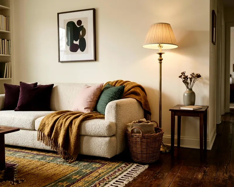
Which living room paint colors suit the light you get
Choose the right living room paint colors by matching your space with the daylight you get. Learn how to balance undertones and light reflection values.
- Styled by Lenora Kittredge
- 8 minute look
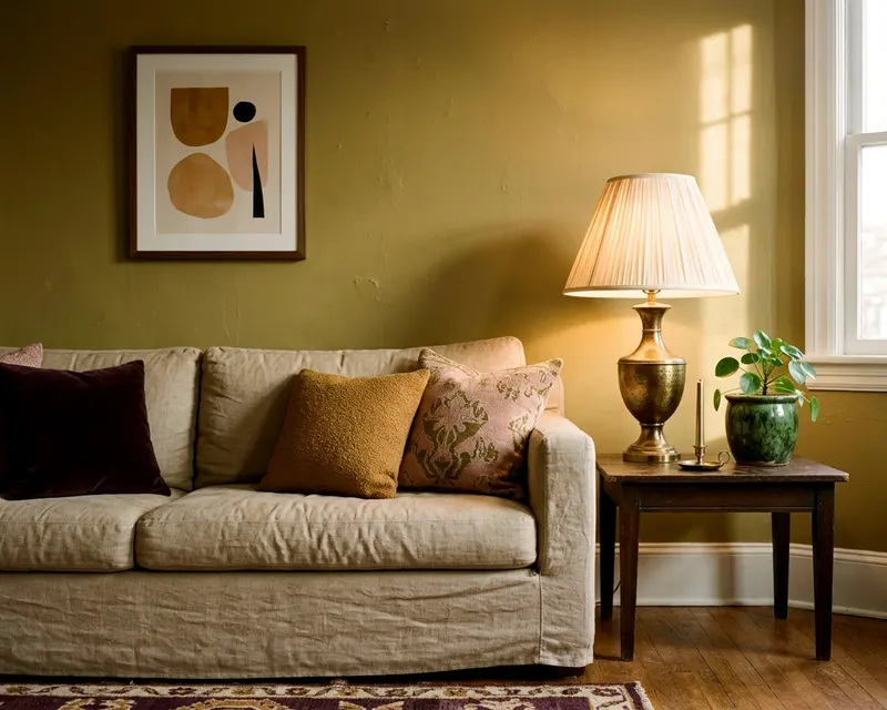
The right living room paint colors depend heavily on the light coming through your windows. A color that looks crisp in a bright southern room will often fall flat and cold in a dim northern space. You find the correct match by pairing the paint undertones with the direction the room faces.
Why the same color looks different in every living room
Daylight carries its own distinct color tone. A bright blue sky bounces a cool tint into the room. A setting sun throws orange light across a woven rug. The paint simply reflects whatever light hits the wall.
The wall closest to the window catches the most direct light. The wall holding the window often sits in shadow. The paint color will look slightly different on every single wall in the room. This makes picking a color from a small paper chip difficult.
A pale gray swatch can look crisp in the store and muddy on your wall because stores use bright commercial lights. Your living room uses filtered sunlight and warm table lamps. You need to read the light in your specific room before you buy the paint.
Outside forces also change the light before it reaches your glass. A large leafy tree blocks the sun and filters a green tint into the space. A red brick house next door bounces a pink cast through your window. The paint takes all of these tints and blends them together.
You can hang heavy drapes to block some reflections, but the base daylight will largely dictate how the paint behaves.
Read the LRV before you fall for a chip
Paint stores often print a number on the back of paper swatches. This number represents the light reflectance value. Sherwin-Williams defines LRV on a scale from 0 (absorbs all light) to 100 (reflects all light).
A pure black wall absorbs the light and makes a room feel dark. A pure white wall reflects the light and brightens the space. You use this number to predict how a color will behave once it covers four large walls.
Rooms with very little natural light often do best with paint that has a high light reflectance value. A high number bounces the available light around the room. Bright rooms with large windows can often handle a lower number without feeling like a cave.
Pure white paints sit high on the scale. Dark accent colors sit near the bottom. A middle ground neutral lands right around the center. You can quickly narrow down your choices just by checking the back of the swatch.
With dark floors or heavy dark furniture, a paint with a higher LRV creates balance. A low LRV paint paired with a dark floor can leave the room feeling heavy.
Colors for north facing living rooms
The windows in a north facing room catch little direct sunlight. The light that does enter is usually indirect and cool. Sherwin-Williams says north facing rooms receive the least light through the day and suggests warm undertones and colors with a higher LRV.
Cool colors look dull and icy in this exposure. A stark white wall can look like dirty ice. A cool gray can turn flat and lifeless. You fix this by pushing warmth into the space through the paint.
Look for colors with yellow, red or warm brown undertones. Creamy off-whites work beautifully here. Warm greens and rich terracotta shades add depth. The warm undertones balance the cold blue light from the window.
A north facing room is an excellent place to hang warm, textured decor. You can hang a large wall tapestry to bring physical warmth to a plain wall. You can also place a brass sconce against a warm cream wall. The metals reflect light and amplify the cozy undertones.
Colors for south facing living rooms
Rooms pointing south receive intense sunshine for most of the day. The light feels bright, golden and very warm. Sherwin-Williams says south facing rooms get consistent warm light, so neutrals can look warmer and cool tones more neutral.
You have many options in a southern room. The warm light can make cool blues and greens look more neutral. A stark white wall often looks brilliant rather than cold. A crisp cool gray can feel refreshing when bathed in warm sunlight.
You do need to watch out for strong warm colors. A yellow that looks cheerful on a paper chip might look overwhelming when baked in southern sunlight. Test warm neutrals carefully because the sun can amplify hints of yellow or red.
Dark colors can also work in south facing rooms. The volume of light may keep a dark navy or a forest green from feeling gloomy. Strong sun can wash out pale colors, so a lower LRV may give the walls more presence.
You can use the bright light to highlight detailed decor. A southern room is the perfect spot to style a bookshelf so it looks arranged, not crowded. The light casts sharp, interesting shadows across the shelves all day long.
East and west facing rooms and when you use them
Rooms facing east or west change dramatically as the day goes on. You need to decide when you actually sit in the room. East facing rooms get bright morning sun and spend the afternoon in shadow. West facing rooms stay shadowy all morning and heat up with golden light in the late afternoon.
Think about whether you read the paper here in the morning or watch television here at night, and pick the color for the time you use the space most.
If you use an east facing room in the afternoon, treat it like a north facing room. The light will be cool and indirect. You will want warm undertones to keep the room feeling comfortable.
If you use an east facing room in the morning, the light is bright but clear. Warm colors glow nicely, and cool colors look fresh.
If you use a west facing room in the late afternoon, the light will be very intense and warm. You can use cool undertones to balance the heat. A cool blue or gray looks lovely against a setting sun. The orange light stops the blue from feeling chilly.
If you spend mornings in a west facing room, the light is often dull and gray. You may want warm paint colors to make the room feel inviting before noon.
Rooms with little daylight and the bulbs you use
Some living rooms sit deep inside an apartment or behind a large covered porch. These rooms lack strong natural light at any time of day. You rely mostly on the fixtures in your ceiling and the lamps on your tables. The bulbs in those lamps dictate how the paint looks.
Sherwin-Williams suggests choosing colors for a room with little daylight as you would for a south facing room if the lighting is warm, or a north facing room if it is white or cool.
You control the temperature of the room by changing the light bulbs. A warm white bulb throws a warm yellow glow across the walls. A warm light needs warm paint colors to avoid looking muddy. You can read about what light color temperature to use in each room to match your bulbs directly to your paint.
A bulb with a white or cool temperature casts a cooler light. You treat this like a north facing room. Warm undertones and a high light reflectance value will stop the room from feeling like a cave.
You can also add mirrors to bounce the artificial light. A large floor mirror or a wall mirror makes the room feel brighter. Hang it opposite a warm lamp to spread the warm glow.
Testing large samples on more than one wall
You should never buy gallons of paint based on a small paper square. The paper does not show the texture of your drywall. The small size does not trick your eye the way an entire wall does. You need to test large samples inside the actual room.
You can buy small test pots of paint and apply them to poster board. You can also order large peel and stick samples. Both methods let you move the color around the room.
If you plan to decorate a living room from bare floor to finished using a completely new color scheme, start with the paint samples.
- Paint two thick coats onto a large piece of white poster board.
- Leave a wide white border around the edge of the painted area.
- Tape the board to the wall holding the window.
- Tape another board to the wall opposite the window.
- Check the boards in the morning, at noon and after dark.
- Turn on the floor lamp or the wall sconce to see the change.
The white border stops the old wall color from confusing your eye. The old paint will always try to contrast with the new sample. A blue gray sample looks incredibly blue against a yellow wall. The white border isolates the new color.
The color will look different on the window wall than it does on the back wall. The shadows stretch and change as the sun moves across the sky. The warm light from a table lamp completely alters the undertone after sunset. Take a few days to watch the sample boards as the light changes.
You should also look at the samples next to your largest pieces of furniture. A gray paint might look perfect on the wall but clash with a green velvet sofa. Place the sample board right behind the throw pillow. Stand back and view the whole arrangement.
Write the brand and color name on the back of each board so you can reorder the winner.